Select Works
Case studys
Cheyenne Mountain Zoo Website - UX Case Study
Introduction
This redesign focused on reducing the cognitive load visitors experienced while navigating the Cheyenne Mountain Zoo website. The original interface overwhelmed users with dense text, unclear hierarchy, and a confusing ticketing process. My goal was to simplify the flow, restructure information, and create predictable visual patterns that made every next step obvious.
Challenge
The biggest challenge was simplifying an overly complex ticket-buying process filled with repetitive information and ambiguous actions. Users struggled to understand the sequence of steps, and the visual hierarchy often misdirected their attention.
Research
Summary
My role
Usability Testing of the Current Website
Users repeatedly described the existing website as overwhelming, especially due to long text blocks and inconsistent layout structure. Several comments highlighted the core issues:
“Water-logged with text that no one will read.”
“No clear button to buy tickets.”
“Next step is unclear and too many pages.”
“Unnecessary blank space on one side, crammed on the other.”
These insights made it clear that the redesign needed clearer hierarchy, simplified content, and fewer steps.
Testing my First High Fidelity Prototype
In early prototype testing, users continued to struggle with the ticket-selection page, especially with the buttons “Add day to cart” and “Go to cart.” These labels created hesitation and frequent misclicks, revealing that the sequence of steps didn’t match users’ expectations. Common reactions included:
“I’m not sure what I’m adding here.”
“Why are there two buttons for the same thing?”
“This feels like too many steps for one ticket.”
Simplifying the page to a single “Add to cart” button and reorganizing the layout drastically reduced confusion
How Might We…
How might we create a simple, intuitive ticket-purchasing experience that guides users effortlessly from date selection to checkout?
Design
Problem Statement
The design needed to help users quickly understand what to do without relying on dense text or unnecessary pages. I focused on simplified content, strong visual hierarchy, and interaction patterns that aligned with user expectations. The goal was to create a playful yet accessible system that matched the zoo’s brand.
Task Flow
Mid-Fidelity Wireframes
In the mid-fidelity stage, I focused on clarifying the layout and hierarchy before adding visual styling.
Reflection
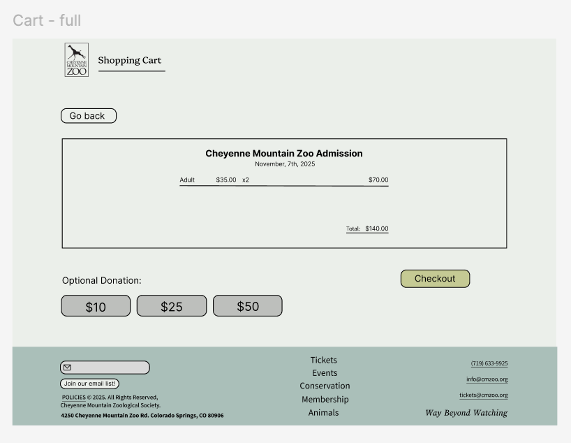
I redesigned the ticketing experience by removing redundant pages, converting long text into dropdowns, and improving visual hierarchy. Key actions like “Get Tickets” were repositioned for higher visibility, and spacing was standardized to guide users more intuitively. User testing and instructor feedback directly shaped the spacing, button logic, and component structure used in the final prototype.
High-Fidelity Wireframes
In the first high-fidelity prototype, I added color to bring the design to life.
Version 1
I served as both the UI/UX Designer and UX Researcher, conducting user interviews, running usability tests, synthesizing insights, and iterating on wireframes and prototypes. As the sole designer, I oversaw the entire process from research through high-fidelity design.
Version 2
Evaluation and Results
In the second high-fidelity prototype, I used instructor critiques and user feedback to refine the colors and align elements more consistently and intentionally.
Instructor Feedback
Feedback focused on standardizing spacing, improving contrast ratios, and clarifying button hierarchy. I addressed issues with misalignment, cluttered layouts, and unclear action priority across pages. These refinements strengthened the clarity and consistency of the entire system.
Before and after
Testing revealed friction around task order, button meaning, and inconsistent spacing. Users often misinterpreted secondary actions as primary ones, leading to errors in the ticket-selection step. By reorganizing layout, strengthening hierarchy, and simplifying actions, the redesigned flow eliminated these issues and improved task completion.
Future improvements
If I continued the project, I would explore expanding the color palette to reintroduce more of the zoo’s playful identity while maintaining accessibility standards. I would also run additional rounds of user testing on the final prototype to validate improvements and identify remaining friction points.
What I learned
This project deepened my understanding of usability testing, unbiased interviewing, and the value of iterative critique. I strengthened my intuition around spacing, hierarchy, and interaction flow, seeing firsthand how small adjustments can dramatically improve user comprehension. I’m excited to apply these skills to future projects and continue refining my design process.


